Welcome! This tool gives you fine-grained control over the look and fields of your form. Drag and drop field types into your form and customize the prompts to build your desired form. Explore the tool options below.
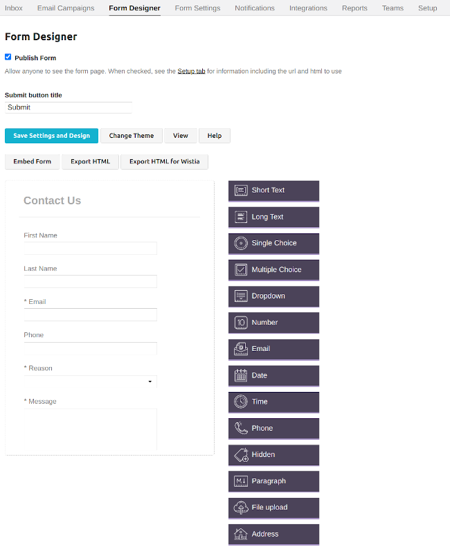
Makes your form live so it can receive submissions. Check the Publish checkbox to obtain a URL to send your form directly, and html code to embed on your site.
See the Setup tab after saving for the details.
Changes title of button on form that prompts user to submit their answers
Saves your in-progress form, does not publish.
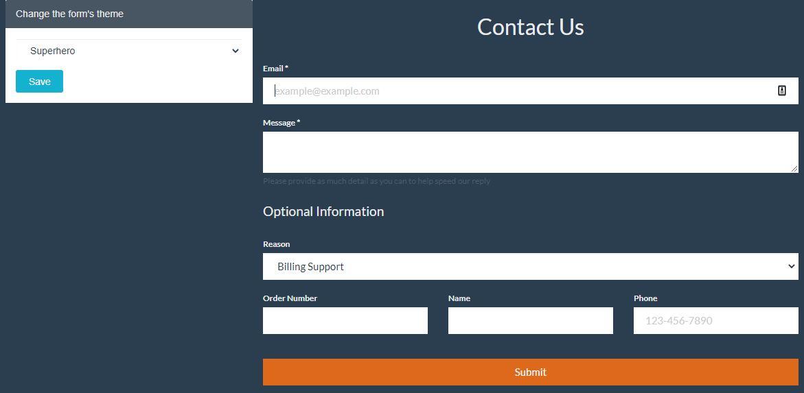
Change default theme (font, colours, etc) that is shown to users. There are several preset themes available, plus a Custom Theme that allows you to set colors and fonts on the form.
See the final results of your form, without all the editing ui in the way.
Takes you to the Setup tab that will display the url for your form or the html code to embed the form on your site.
You can use this HTML as a starting point for creating and styling your own form to host on your site.
It uses some basic classes from bootstrap to get you started and has links to include bootstrap and jquery.
You can remove those if you don’t need them, or add additional fields yourself.
If you select the Custom Theme you can set fonts and colors, and those will get exported.
The other themes are not supported in this export feature.
If you make changes using the Form Designer you would need to re-export this HTML.
You can also dynamically embed the form so that changes made in the Form Designer show up automatically.
You only need to include jQuery if you’ve set any Field Rules to hide / show fields.
Wistia is an external video marketing platform. See the wista guide and the instructions in the exported html for properly using the html inside a wista video.
The theme customizations are limited under wistia, so review and test your form before making it live.
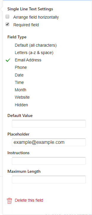
Most fields can be arranged horizontally, marked as a required field, take a default value, placeholder and instructions. See the gear icon for changing these values. In this guide, “user” is the recipient of your published form.
If you hover your mouse over certain fields, you’ll see an icon to Delete or open the Settings panel for the field. You can also drag the field to rearrange the order of the fields in the form.

A useful field for obtaining short text-based answers like as “name” or “email”. There is no maximum answer length, but the thin answer box makes it hard to see more than a few words at a time.
Using the gear icon you can change some settings for this field:

A useful field for obtaining long text-based answers such as “reason (for contacting)” or a body of an email, etc. There is no maximum answer length, and the larger answer box makes it convenient to see larger amounts of text at a time.

User can make one selection. A useful field for prompts where only one answer is correct or needed, like quiz questions such as “when was Charmlemagne born?” with 5 possible answers to chose from.
(The correct answer btw is “2 April 748 AD”).

A useful field for prompts where multiple answers could be correct or needed. User can make multiple selections.

A bit like single choice field type but with a different UI. Allows user to make one selection.

A useful field for prompts where a numeric answer is required. User must enter a numeric value or else when they submit, they will be given an error.
This checks for an @ symbol in the field, if you need additional checks, see the Field Validation rules to more fully restrict it, or the settings under Spam->Detect spam using email address.
User must enter a date. They can write the date themselves in MM/DD/YYYY format, or they can use a UI to find their date.
User must enter a time in 12 hr format.
User must enter a phone number.
This will not display in the form, but will send the data to you when submitted. Useful if you need to track some marketing information such as user’s email address.

Is used to display help or other static text on your form. See the guide on formatting for the supported Markdown.

Prompt user to upload a file. See your plan details for limits on the amount of file uploads that are allowed. Max size 10MB per file.

This creates a field to have the user add their address with separators for Street Address, City, State, Province, Region, Postal/Zip Code, and Country.